
The Executive Summary report is an overview of key performance indicators (KPIs), backup success rates and trends over time to get high-level backup activity metrics. It's designed to be shared with customers and stakeholders to demonstrate your backup monitoring effectiveness.
In this report, you can view summary data by Organization, Connection, Backup Group (a.k.a. Backup Policy) or Resource in the date range of your choosing, in both a graphical chart format and data table.
The Executive Summary report can be configured and saved as a custom report, then scheduled for automatic distribution via email in HTML and/or Excel formats.
Report Defaults & Criteria
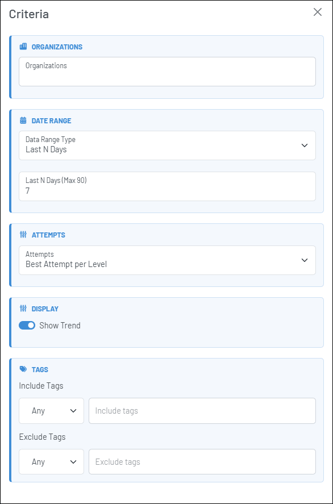
By default, the report will display summary data from all Organizations you have access to for the past 7 days, representing the Best Attempt per day. You can change the report criteria to set a different date range, select one or more specific Organizations, change it to display "All Attempts," etc. to match what you want to see. You can also use tags to include/exclude certain tagged resources.
Additionally, you can click on the tabs at the top of the KPI tiles to switch between looking at the data by Organization, to viewing it by Connection, Resource or Backup Group.

Key Performance Indicators (KPIs)
The top row of data in the report reflects a summary of backup rates based on the criteria used, including the percent and number of Total Successful Backups, Successful (including partial) Backups, Partial backups, and Failed backups. It also includes the Total Data Protected, which is a sum total of the bytes transferred.

Top 5 / Bottom 5
Each tab (Organization, Connection, Backup Group & Resource) has a set of "Top 5" and "Bottom 5" indicators of backup success rates, data protected or backup job duration. This information is also based on the report criteria used.
For example, if the Organization tab is selected, the "Top 5 By Success Rate" tile indicates the five Organizations with the highest backup success rates.

Trend Graph & Grid Report
The trend graph represents Backup Success rates over time and is based on the report criteria used. It is also responsive to the grid report beneath the graph. For example, if you sort the grid report by one of the columns, or filter the report in one of the columns, the graph will update accordingly.
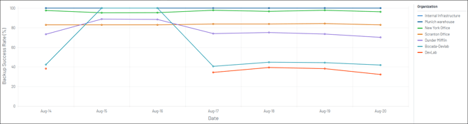
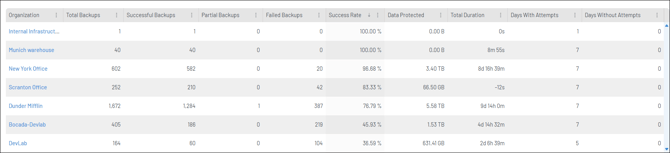
Note: if you have a large number of Organizations, the graph will only represent up to 20 at a time. To see one or more specific Organizations in the graph, use the "Edit Criteria" menu to select which Organizations you want to view. Or, you can filter or sort the Organizations column in the grid.
Drill-Down into the Data
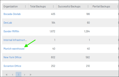
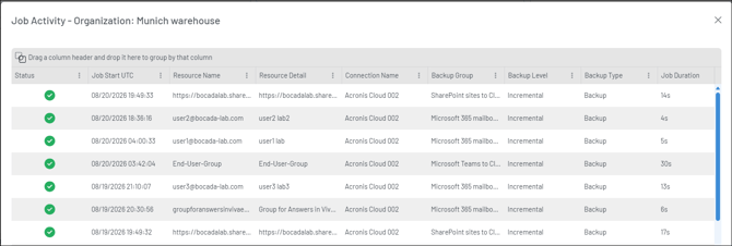
In the grid report, click on the item in the first column (either Organization name, Connection Name, Backup Group name or Resource Name) depending on which tab of the report is active. That will launch a pop-up Job Activity report for that item displaying the individual backup jobs.
Save as a Custom Report, Export and/or Distribute it via email in HTML or Excel Formats
Click the three-dot menu in the top right of the page to see a variety of actions, including the ability to configure and save a custom version of the report; export it in HTML or Excel formats; and/or choose to automatically have it distributed via email as an attached file.
Note: under the "Edit Criteria" menu, you can click the "Show Trend" toggle to either display or not display the trend graph in the report when viewed in the application, and/or when exporting or distributing the report.
If you have any questions or issues when using the Executive Summary report, please submit a support ticket or contact us.